11 WooCommerce Product Page Mistakes Killing Your Sales (And How to Fix Each One)

Share this content
Copy Link
Share



Design WooCommerce Stores That Convert
-
100+ Widgets
-
15+ Modules
-
150+ Templates
-
At Your Service
Follow us on:


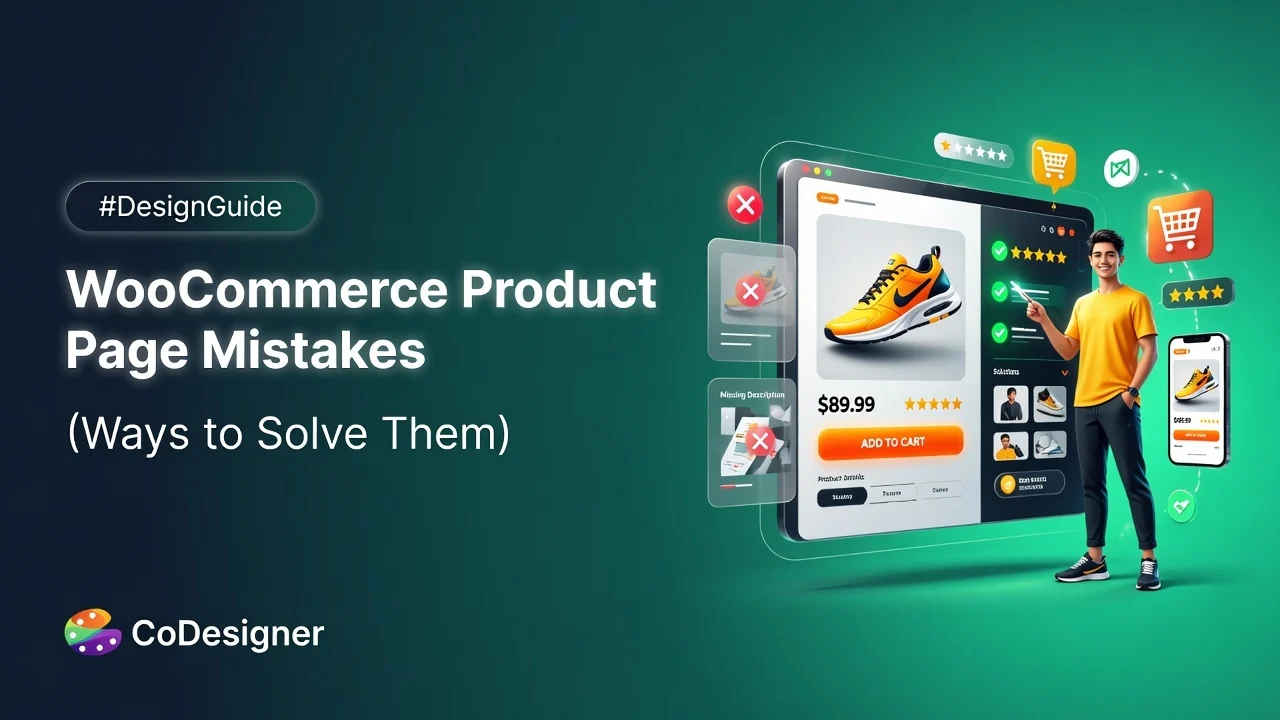
Most WooCommerce stores don’t have a traffic problem. They have a product page problem. And it is happening for WooCommerce product page mistakes.
You’ve worked hard to bring shoppers to your store. Ads, SEO, social media. All of it funnels to this one page. But if the page isn’t built to convert, that effort goes to waste. According to Baymard Institute’s benchmark research, 62% of mobile ecommerce product pages score “mediocre or worse” for UX performance. On desktop, only 48% of leading sites manage even a “decent” rating.
The problem isn’t WooCommerce itself. The problem is that WooCommerce gives you a functional starting point, and most store owners stop there. A default product page won’t make shoppers trust you. It won’t answer their objections. It won’t guide them toward buying.
Here are 11 specific mistakes that show up on WooCommerce product pages, what each one costs you, and what to do about it.
What Your WooCommerce Product Page Is Actually Supposed to Do
Before getting into the mistakes, it helps to be clear on the goal.
A strong product page does four things:
- It builds trust,
- Removes friction,
- Answers the questions a shopper has before buying, and
- Makes the path to purchase obvious.
When any one of those breaks down, you lose the sale, usually without knowing it happened.
What does WooCommerce’s default product page give you?
WooCommerce ships with a product page template that’s functional but completely bare. You get a product image block, a title, a price, a short description, and an Add to Cart button. That’s it.
No layout control. No conversion-focused design. No sticky buy button, no organized tabs, no trust signals, no upsells, no wishlist. For a store trying to compete today, the default is a starting point, not a finished page.
That’s the root cause behind most of the mistakes below. Not carelessness from store owners, but a gap that WooCommerce simply doesn’t fill on its own. Tools like CoDesigner exist specifically to bridge that gap inside Elementor, without writing a single line of code.
Quick Summary Table Before You Start
Below are 11 specific mistakes found on WooCommerce product pages, along with what they cost you and how to fix them.
| # | Mistake | What It Costs You | Quick Fix |
| 1 | Low-quality or single-angle images | Shoppers question product quality before reading a word | Minimum 5 images per product: front, back, detail, close-up, lifestyle |
| 2 | Plain dropdown variation selectors | Higher hesitation, lower add-to-cart rate | Replace dropdowns with visual color or image swatches |
| 3 | Feature-only product descriptions | Shoppers don’t connect specs to value | Lead with the benefit, support it with the spec |
| 4 | Disorganized product information | Shoppers can’t find what they need and leave | Organize content into clearly labeled tabs |
| 5 | No product-level FAQ | Unanswered questions send shoppers to competitors | Add the top 3 to 5 pre-purchase questions per product category |
| 6 | Reviews hidden or absent | Page looks untested; trust drops | Display star ratings and reviews near the product title |
| 7 | No trust signals near the buy button | Cart hesitation at the most critical moment | Add a compact trust block beside the Add to Cart area |
| 8 | Add to Cart button disappears on scroll | Shoppers don’t scroll back up to buy | Use a sticky add-to-cart bar |
| 9 | No upsells or cross-sells | Missed average order value on every transaction | Add a styled, intentional upsell or cross-sell section |
| 10 | Poor mobile experience | Over 60% of traffic gets a broken experience | Design and test for mobile first, not as an afterthought |
| 11 | No wishlist | Undecided shoppers leave with no way back | Add a wishlist button to every product page |
WooCommerce Product Page Mistakes Killing Your Sales | 11 Mistakes and Fixes
The WooCommerce product page mistakes covered in this guide are organized into categories like design, copy, trust signals, and user experience.
WooCommerce Product Page Mistakes That Hurt Your Visual Presentation
Mistake 1: Low-quality or single-angle product images
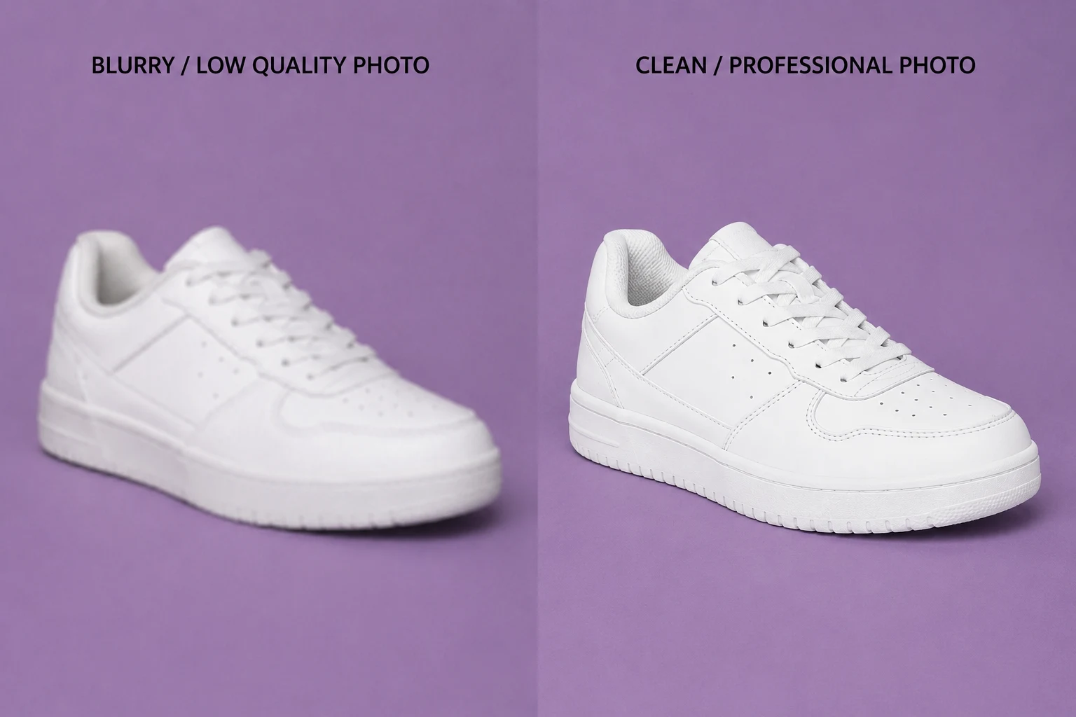
Shoppers can’t touch your product. They can’t pick it up, feel the weight, or inspect the stitching in person. Your images are the substitute for that physical experience.
When those images are blurry, poorly lit, or shot from a single angle, shoppers assume the product quality is low, too. It doesn’t matter how good the product actually is. Perception wins.
Research shows that 75% of online shoppers rely primarily on product images when deciding to purchase. That makes image quality one of the highest-leverage improvements you can make to any product page.
The fix: Publish a minimum of five images per product: front, back, side, or detail, a close-up on a key feature, and one contextual shot showing the product in use or next to a size reference. For fashion and home goods, more is better.
Mistake 2: Plain dropdown variation selectors
WooCommerce’s default variation selector is a plain dropdown. For products with colors, sizes, or material options, this is a missed opportunity.
Dropdowns hide your options by default. Shoppers have to click to see what’s available, can’t visually compare colors at a glance, and often have no clear indicator of which variations are out of stock. It looks like a form field. Not a shopping experience.
Baymard Institute’s usability research found that 57% of ecommerce sites still use dropdown menus for color and size selection, and that this consistently leads to higher hesitation and lower add-to-cart rates.
The fix: Replace dropdowns with visual swatches. Color blocks, image thumbnails, and labeled buttons all reduce hesitation and make variation selection feel natural. Shoppers should be able to see their options without clicking anything.
CoDesigner includes variation display widgets that you can set up directly inside Elementor. No separate plugin, no code required.
WooCommerce Product Page Mistakes That Hurt Your Copy and Content
Mistake 3: Product descriptions that list only features, not benefits
“100% polyester. 200g/m2. Machine washable.”
That tells a shopper almost nothing they actually care about. Features are specs. Benefits are outcomes. “Lightweight enough to wear all day, warm enough to hold heat in cold weather, and easy to clean after heavy use” is the same information, written in a way that sells.
Shoppers aren’t reading product descriptions to learn technical details. They’re reading to find out if this product will solve their problem or improve their situation.
The fix: For every feature you list, ask “what does this do for the shopper?” Lead with the answer. Then support it with the spec. Benefit first, feature second. That structure is consistently more persuasive than the reverse.
Mistake 4: Disorganized product information buried in long pages
Product pages often become content dumping grounds. Descriptions, specs, care instructions, return policies, and reviews are stacked into one long block with no structure.
Shoppers looking for a specific piece of information, like “does this come in wide sizing?” have to scroll through everything to find it. Most don’t. They leave.
The fix: Organize product content into clearly labeled tabs. Description, specifications, care or usage instructions, and reviews each get their own section. Shoppers can navigate directly to what they need without reading through everything.
CoDesigner’s dynamic product tabs widget lets you build custom tab layouts inside Elementor. You control which tabs appear, what content each one holds, and how they look. It’s a straightforward fix for one of the most common layout problems on WooCommerce product pages.
Mistake 5: No product-level FAQ section

Unanswered questions don’t lead to emails or phone calls. They lead to shoppers leaving and buying from a competitor who already answered the question.
Does this ship internationally? Is this compatible with my existing setup? What’s the return window if sizing is off? These are pre-purchase objections. When you answer them on the page, you remove the friction standing between a shopper and the buy button.
The fix: Identify the three to five most common questions for each product category and answer them directly on the page, inside a dedicated tab or in a short FAQ section below the main description. If customers ask you the same question twice in a week, it belongs on the product page.
WooCommerce Product Page Mistakes That Reduce Trust
Mistake 6: No customer reviews are visible on the page
Shoppers trust other shoppers more than they trust you. That’s not a criticism. It’s simply how buying decisions work online.
Products with reviews convert up to 270% better than products with none. A page with no reviews doesn’t look professional. It looks untested or new in a way that raises doubt.
WooCommerce does include a review tab by default, but it sits below everything else and doesn’t display star ratings prominently near the product title. Many shoppers never scroll far enough to see it.
The fix: Make reviews and star ratings visible early, ideally near the product title and price, not only at the bottom of the page. Actively request reviews from customers post-purchase so the section fills up over time.
CoDesigner’s single product page builder gives you direct control over where reviews appear. Move them up, style them to match your brand, and make sure they’re visible before the shopper starts scrolling.
Mistake 7: No trust signals near the buy button
Return policy. Secure checkout badge. Delivery estimate. Free shipping threshold.
These small elements make a real difference at the moment a shopper decides to add something to their cart. But WooCommerce’s default layout has no designated spot for them, so most stores never include them.
The result: shoppers with a question about returns or payment security have to go find your policies page. Most won’t. They’ll just close the tab.
The fix: Add a compact trust block just below or beside the Add to Cart button. Three to four short lines covering your return window, secure payment method, and delivery estimate is enough. Keep it brief and factual.
Because CoDesigner gives you full drag-and-drop control over your product page layout in Elementor, adding that trust block is a widget placement, not a development task.
Read more on How to Increase Conversions with Trust Elements
WooCommerce Product Page Mistakes That Create Friction at the Buy Decision
Mistake 8: The Add to Cart button disappears when shoppers scroll
This is a simple problem that costs stores a surprising number of sales.
On any product page longer than a few screens, the Add to Cart button scrolls out of view. Shoppers who spend time reading the description, checking tabs, and scanning reviews now have to scroll all the way back up to buy. Some do. Many don’t.
The fix: A sticky add-to-cart bar that stays in a fixed position as the shopper moves down the page. It keeps the buy action visible at all times without getting in the way of the reading experience.
CoDesigner’s product widgets include a customizable Add to Cart button you configure inside Elementor. Adjust the label, colors, and positioning to fit your store’s design, with no code needed.
Mistake 9: No upsells or cross-sells on the page
The product page is the single best moment to increase average order value. A shopper who’s already interested in one product is the easiest person to show a relevant upgrade or complementary item.
WooCommerce does include a default “You may also like” section, but it’s unstyled, placed far down the page, and most shoppers never reach it. Many store owners turn it off entirely. Both leaving it unstyled and removing it are mistakes.
The fix: Add an intentional upsells or cross-sells section with relevant products, clear positioning, and styling that matches your store. Accessory suggestions, product upgrades, and “frequently bought together” groupings all perform well when placed thoughtfully.
CoDesigner has dedicated upsell and cross-sell widgets you can drop into any product page layout and style from scratch, replacing WooCommerce’s default section with something that’s actually designed to convert.
WooCommerce Product Page Mistakes That Hurt Mobile Shoppers
Mistake 10: Treating mobile as an afterthought
Over 60% of ecommerce traffic now comes from mobile devices. A product page that looks fine in a desktop browser and breaks on a phone is quietly pushing away the majority of your visitors.
The most common problems: images that don’t scale correctly, tap targets too small for thumbs, text that requires zooming to read, and Add to Cart buttons positioned awkwardly on narrow screens.
The fix: Test on real devices, not browser previews. Check tap target sizes, button placement, image scaling, and load time. Compress images. Remove page elements that add load weight without adding value. Mobile performance should be a deliberate design decision, not an afterthought.
CoDesigner’s product page templates are built in Elementor, which gives you responsive controls per breakpoint. You can adjust layout, spacing, and element visibility at the mobile level independently from desktop. No separate mobile theme needed.
Mistake 11: There’s no way for shoppers to save products for later
This is the mistake almost no WooCommerce product page guide mentions. And it’s a real one.
The average ecommerce conversion rate sits between 1.6% and 2.5%. That means somewhere between 97% and 98% of your product page visitors aren’t buying on their first visit. Some need more time. Some are comparing options. Some are waiting for payday.
If your product page has no wishlist, those shoppers leave, and they rarely come back. WooCommerce has no built-in wishlist feature, which means most stores never add one.
A Metrilo study across 50 online stores found that stores adding wishlist functionality saw an average 19.3% increase in sales. Wishlist features also tend to lift average order value by roughly 20%, because shoppers save multiple items and return to buy more than one.
The fix: Add a visible, easy-to-use wishlist button to every product page. It should work without requiring shoppers to create an account.
CoDesigner includes a full wishlist feature with a customizable wishlist table and complete style control through Elementor. It’s one of the most underused features available to WooCommerce stores, and one of the easier wins on this list. If you’re already using CoDesigner for your product page customization, enabling the wishlist takes a few minutes.
Final Words: Start Fixing the Mistakes Today
Most of these problems come back to the same root cause: WooCommerce gives you a working product page, not a converting one. The gap between functional and effective is where the sales get lost.
None of these fixes requires a developer or a rebuild from scratch. Their configuration and layout decisions, and most of them take less time to fix than it took to read this article.
Start with the layout. Or start with the wishlist. Both are faster wins than most store owners expect.
Frequently Asked Questions
What is the most common WooCommerce product page mistake?
The most common mistake is leaving the default WooCommerce layout completely uncustomized. The default template gives you an image, a title, a price, and a description. Nothing else. No sticky Add to Cart button, no visual variation swatches, no trust signals, no wishlist. Fixing the layout addresses several conversion problems at once, which is why it’s usually the right place to start.
Can I customize WooCommerce product pages without writing code?
Yes. With an Elementor-based plugin like CoDesigner, you can rebuild your product pages through drag and drop. Layout adjustments, variation widgets, organized product tabs, upsell sections, and review placement. All of it is configurable without touching PHP or CSS. CoDesigner’s free version is available on WordPress.org and gives you a solid set of widgets to start with.
How many product images should a WooCommerce product page have?
A minimum of five: front, back, side or detail, a close-up on a key feature, and one contextual or lifestyle shot. Products with only one or two images consistently underperform. More angles reduce purchase hesitation by giving shoppers the visual detail they’d normally get from inspecting a product in person.
Does adding a wishlist actually affect WooCommerce sales?
Yes, measurably. A Metrilo study across 50 stores found a 19.3% average sales increase after adding wishlist functionality. The logic is simple: shoppers who aren’t ready to buy immediately need somewhere to save their intent. Without a wishlist, that intent disappears the moment they close the tab.