Upselling and Cross-Selling in WooCommerce: Display Tactics That Actually Work

Share this content
Copy Link
Share



Design WooCommerce Stores That Convert
-
100+ Widgets
-
15+ Modules
-
150+ Templates
-
At Your Service
Follow us on:


Most WooCommerce stores treat upsells and cross-sells like a checkbox. Link a product, publish the page, and assume the section will do something. It usually doesn’t.
The problem isn’t the strategy. According to Amazon sales data, Product recommendations drive up to 35% of ecommerce revenue. The problem is the display. WooCommerce ships with linked product functionality that works well on the backend. On the frontend, it renders a plain product grid with no visual hierarchy or design logic. That grid typically sits below the fold, blends into the page, and gets scrolled past.
Getting upselling and cross-selling in WooCommerce to actually convert is not about adding more products to your linked lists. It’s about placing the right recommendation in the right place, styled well enough that customers stop and look.
This guide covers the five key placement zones for upsells and cross-sells in WooCommerce, the design thinking behind each one, and how to build them without writing a single line of code.
Quick Summary
| Tactic | Where It Shows | Goal | Best For |
| Related products / upsell widgets | Product page | Higher-value swap or discovery | Browsers and engaged visitors |
| Cross-sells | Cart page | Add-on before checkout | Committed buyers |
| Order bump | Checkout page | Last-minute add | High-intent buyers |
| Post-purchase offer | Thank You page | Second purchase | New customers |
| Wishlist | Throughout store | Return visits and re-engagement | Returning shoppers |
WooCommerce Upselling vs. Cross-Selling: Key Differences Explained
The terms get mixed up constantly, and the confusion has real consequences for how you set things up.
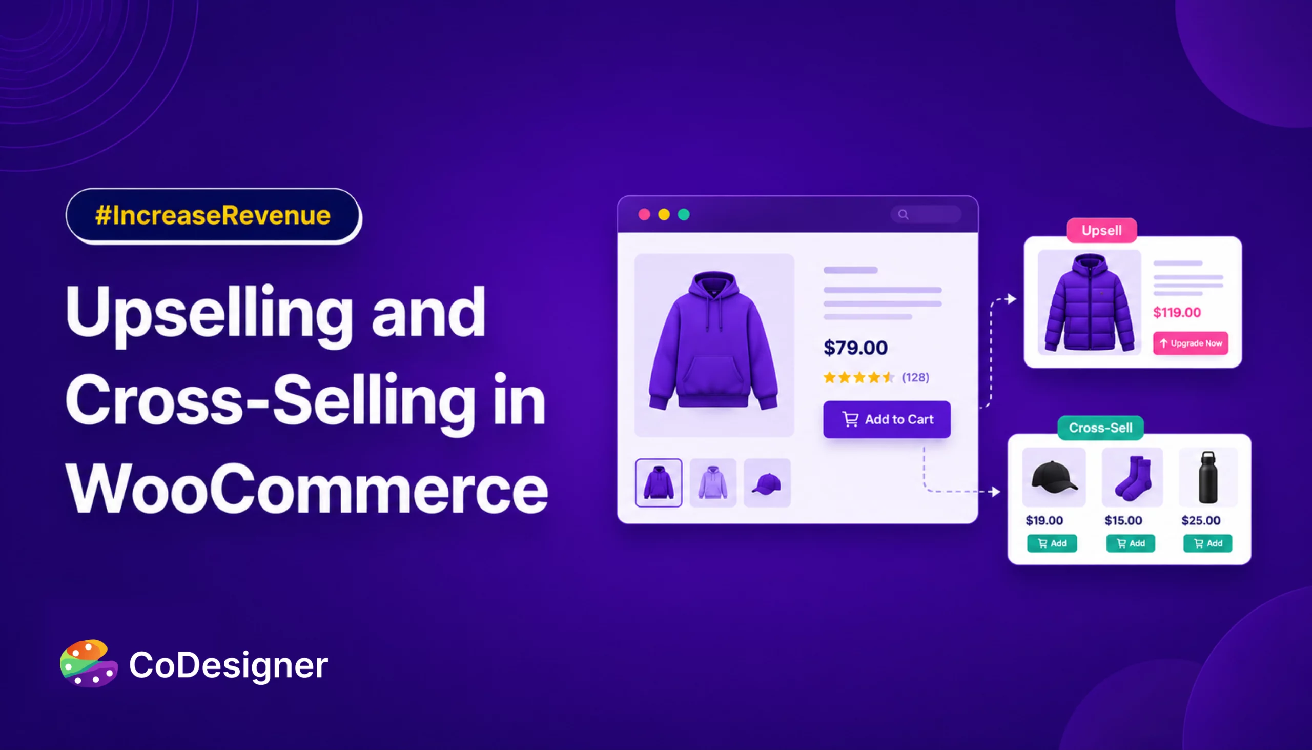
- Upselling is suggesting a higher-value version of a product the customer is already considering. A customer looking at a 500ml water bottle sees a recommendation for the insulated 1L version. The goal is a better product and a bigger sale.
- Cross-selling is suggesting a different product that complements what’s already in view. The same customer sees a recommendation for a matching bottle carrier. The goal is to grow the cart, not replace the item.
In WooCommerce, both are assigned in the same place: the Linked Products tab inside each product’s settings. The placement logic is completely different, though. Upsells appear on the product page. Cross-sells appear on the cart page. Get that backwards, and you’re showing the wrong offer at the wrong moment.
Upselling and cross-selling combined contribute between 10% and 30% of total ecommerce revenue across most stores. That figure is heavily influenced by placement and design quality, not just product selection.
How WooCommerce Handles Upsells and Cross-Sells Out of the Box
Out of the box, WooCommerce displays upsells on the single product page and cross-sells below the cart table. Both show up as a basic product grid. There are no custom headings, no design controls, no framing to tell a customer why they’re seeing what they’re seeing.
The section header reads “You may also like…” and most shoppers don’t register it as anything more than background noise.
Why WooCommerce’s Default Recommendations Get Ignored
WooCommerce’s linked product data is solid. The display layer is not. And this is where most stores lose the revenue they should be earning from recommendations. Customers skip what blends into the page. A recommendation sitting in a generic grid next to the product specs will always underperform the same recommendation when it’s placed, framed, and styled with intention.
Product Page Upsells in WooCommerce: Placement, Layout, and Design
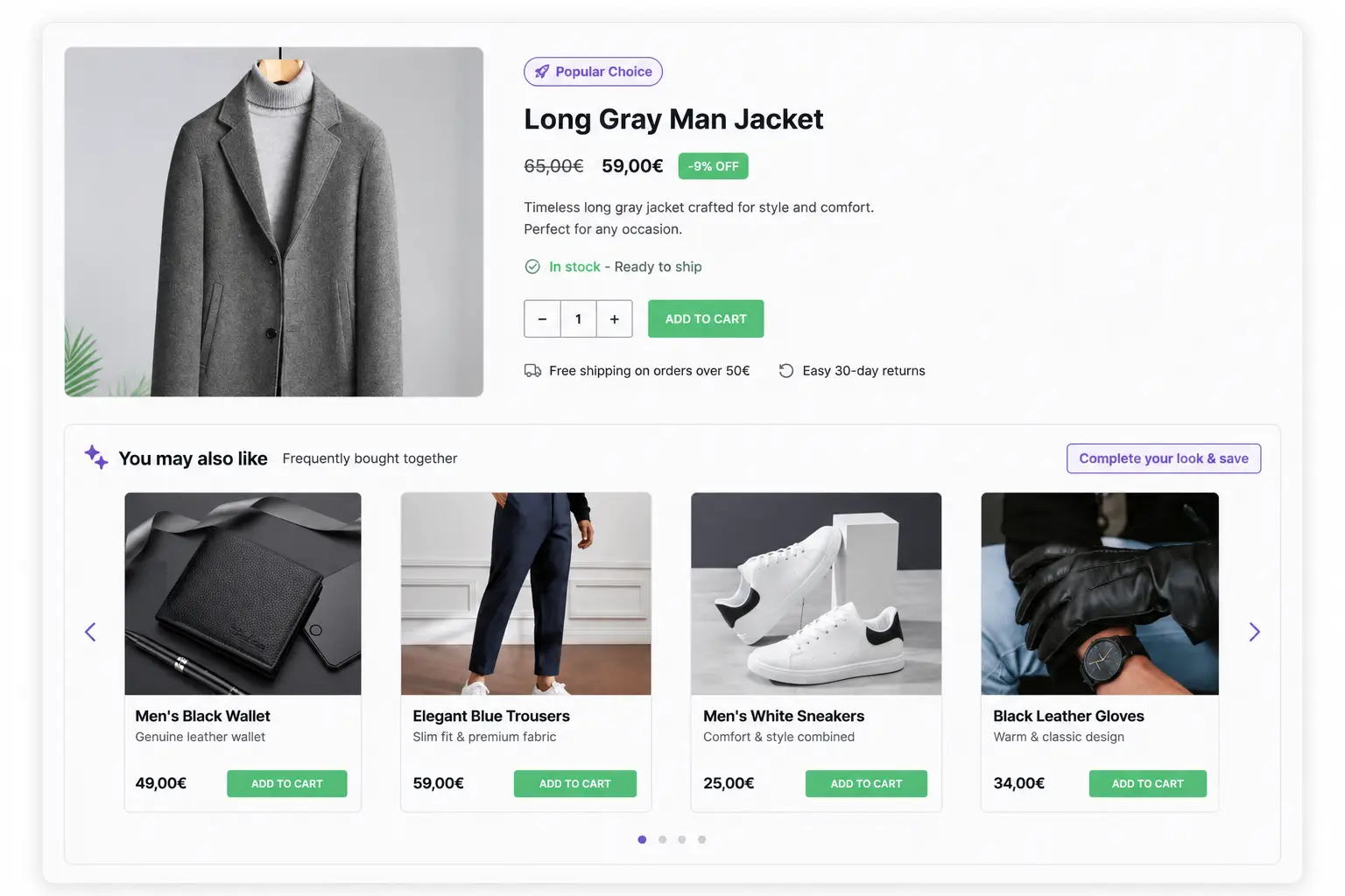
The product page is where a buyer is most open to an upgrade. They haven’t committed to anything yet. They’re evaluating. That mental state is the best possible environment for an upsell to land.
Where to Place Upsell Recommendations on Your Product Page
Location is everything here. The space near the Add to Cart button is the highest-attention real estate on a product page. A recommendation placed there, before the customer moves down the page to specs or reviews, gets far more attention than one buried at the bottom.
The key to making this work is curation. Best practice puts the limit at two to three upsell products per page. More than that, and the offer feels like a store clearing inventory. Each suggestion should communicate a clear value difference: more features, better materials, a larger size. The customer should understand in about two seconds why the upsell is worth considering.
Successful ecommerce businesses see upsell conversion rates between 10% and 25% when recommendations are relevant and well-positioned. That rate drops sharply when the section is unstyled or misplaced.
CoDesigner’s single product page builder gives you full drag-and-drop control over where upsell widgets appear. You can choose from multiple related product display styles (Classic, Flip, Trendy, and Accordion layouts) and position them exactly where you need them on the product page template, without touching any code.
How to Add “Frequently Bought Together” on WooCommerce Product Pages
This is the Amazon tactic, and it works because it frames the recommendation as social proof rather than a sales push. Showing “Frequently Bought Together” implies other customers made this combination. That’s a subtle but meaningful trust signal.
It works best when the logic is obvious. A customer buying a DSLR camera sees a memory card and a camera bag suggested together. A customer buying running shoes sees performance socks and a cleaning kit. The moment the relationship between products isn’t clear, the credibility of the section drops.
WooCommerce doesn’t support this type of bundled display natively on product pages. Getting it right requires a design layer that lets you build the section, frame it properly, and control how the product group appears across devices.
Product Recommendation Design: What Actually Makes Shoppers Click
A few things matter more than most people realize. The section header needs context. “You may also like” is meaningless. “Complete your kit” or “Customers who bought this also chose” gives the reader a reason to look. Thumbnail size should match your product card style elsewhere on the site. On mobile, recommendation grids must stack cleanly without cutting off product names or images.
Cart Page Cross-Sells in WooCommerce: How to Capture Sales Before Checkout
By the time a customer reaches the cart, they’ve already made a buying decision. The mental resistance to spending money is lower than it was on the product page. That’s precisely why the cart page is the natural home for cross-selling.
Why the WooCommerce Cart Page Is the Best Place for Cross-Sells
Cross-sells work here because the customer’s guard is down. They’re not evaluating anymore. They’re ready to buy. A relevant add-on at this stage feels helpful rather than pushy, as long as the offer is small, clearly related, and priced lower than what’s already in the cart.
74% of online store owners use cross-selling tactics to maximize their revenue, and the cart page is where most of that revenue is captured. Keep the suggestion count to three to five products. More than that and you create friction right before checkout, which is the last thing you want at this stage.
How to Design a Cart Cross-Sell Section That Gets Seen
Here’s the real problem with WooCommerce’s default cart layout: cross-sells appear below the cart table. That means a customer who clicks straight to checkout never sees them. They’re positioned for scrollers, not buyers.
A redesigned cart moves the cross-sell section into the sidebar, next to the order summary, or above the “Proceed to Checkout” button. That placement shift alone can meaningfully change how many customers engage with suggestions.
CoDesigner’s cart page widgets let you restructure the entire cart layout, choosing between row or side-by-side arrangements, and position your cross-sell section where it sits in the natural eye path before checkout. For a deeper look at how layout choices affect revenue, this piece on WooCommerce design trends that actually convert covers the principles behind the decisions. Plugins like FunnelKit and UpsellWP also offer cart-based cross-sell functionality if you need dedicated upsell rules on top of your design layer.
Cart Cross-Sell Tips: Price, Placement, and Removing Friction
Price anchoring is the most overlooked factor. Cross-sell items should cost less than the current cart total. A $12 add-on next to a $90 cart feels reasonable. A $75 add-on next to the same cart feels like a second purchase.
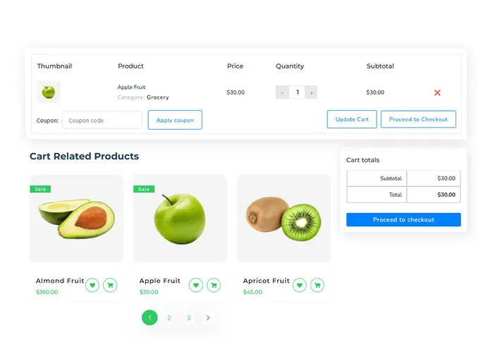
Urgency cues help too. “Ships with your current order” or “Only a few left” lower the decision barrier. The add-to-cart interaction should require as little effort as possible. A single button click, without a page reload, removes the final friction point.
Checkout Upsells in WooCommerce: How to Use Order Bumps
The order bump is the most direct upsell tactic in ecommerce. It’s a single inline offer shown at the checkout stage, typically as a checkbox or a small product card, positioned where the buyer’s full attention is on completing the transaction.
What Is an Order Bump and How Does It Work in WooCommerce?
Unlike a popup or a separate page, an order bump stays inside the checkout flow. The customer checks a box or clicks a button, and the item is added to the order without leaving the page. No extra decision, no extra step.
This format converts well because it catches buyers at maximum purchase intent. The mental framing is already in “buy mode,” and a small, relevant add-on that can be accepted in one click fits naturally into that state. Order bumps work best for low-cost, high-relevance additions: warranties, accessories, digital extras, gift wrapping. The offer should feel like something the customer might have forgotten, not a second sales pitch.
How to Display a Checkout Upsell Without Disrupting the Sale
Placement within the checkout page matters enormously. An order bump above the payment form gets seen. One below the “Place Order” button is effectively invisible. Best practice limits the display to three to five items and recommends not mixing cross-sells and upsells in the same bump. Pick one offer and make it count.
Copy should be brief. One benefit sentence, the price, and a checkbox or button. Anything longer competes with the checkout form for attention and increases abandonment risk.
CoDesigner’s Checkout Builder module lets you customize the layout around your checkout form in Elementor. You can control section ordering, add product recommendation elements at the right position, and build a checkout experience that doesn’t look like the WooCommerce default.
Thank You Page Upsells: How to Earn More Revenue After the Order
The default WooCommerce thank you page is, honestly, a missed opportunity. It shows the order number, the billing address, and a list of what was ordered. That’s it. No next step, no offer, no reason to return.
Why Most WooCommerce Thank You Pages Leave Money on the Table
What happens when a customer finishes checking out and lands on your thank-you page? In most WooCommerce stores, nothing interesting.
Post-purchase momentum is a real psychological factor. A customer who has just bought something is in a positive mental state. They made a decision, they acted on it, and the transaction felt good. That’s the best possible moment to show them something else.
Top-performing stores generate 12.7% of total revenue from post-purchase offers alone. Most WooCommerce stores capture none of it. Platforms like ReConvert and CheckoutWC are built specifically for this use case and are worth evaluating for stores that want dedicated post-purchase funnels.
How to Set Up a Thank You Page Upsell in WooCommerce
The rule here is one offer, not three. A single, clearly relevant upsell after checkout feels helpful. Three offers feel like a newsletter. Keep the recommendation tied directly to what the customer just bought.
A time-limited discount adds urgency without being aggressive. “Add this to your order in the next 30 minutes at 20% off” is enough context. The framing should feel like a benefit, not pressure.
CoDesigner supports Thank You page customization in Elementor. You can design a branded confirmation page with a product recommendation block, loyalty messaging, and a next-purchase prompt, all without custom code. The default thank you page template is replaced entirely, giving you full control over what a customer sees the moment they complete an order.
How WooCommerce Wishlists Drive Future Upsells and Return Visits
Wishlists don’t produce immediate revenue. That’s why most store owners underestimate them. But a wishlist is a signal: a customer has told you exactly what they want. That data is worth using.
How a WooCommerce Wishlist Becomes a Cross-Sell and Re-engagement Tool
A wishlist page is a cross-sell surface in its own right. Related or complementary products shown alongside saved items are seen by customers who are already invested in the product category. The intent level is high, and the context makes recommendations feel relevant rather than random.
Email follow-up tied to wishlist activity is one of the most consistent re-engagement tactics available. A reminder that a wishlisted item is back in stock, or that it’s on sale, brings customers back at the exact moment they’re most likely to buy.
CoDesigner includes a fully customizable WooCommerce Wishlist widget. You can control the table layout, currency symbol, item buttons, and add-to-cart functionality directly from the wishlist page. If you want to set this up from scratch, this guide on how to add a wishlist to your WooCommerce store covers the full process.
Wishlist Page Design: How to Bring Shoppers Back to Buy
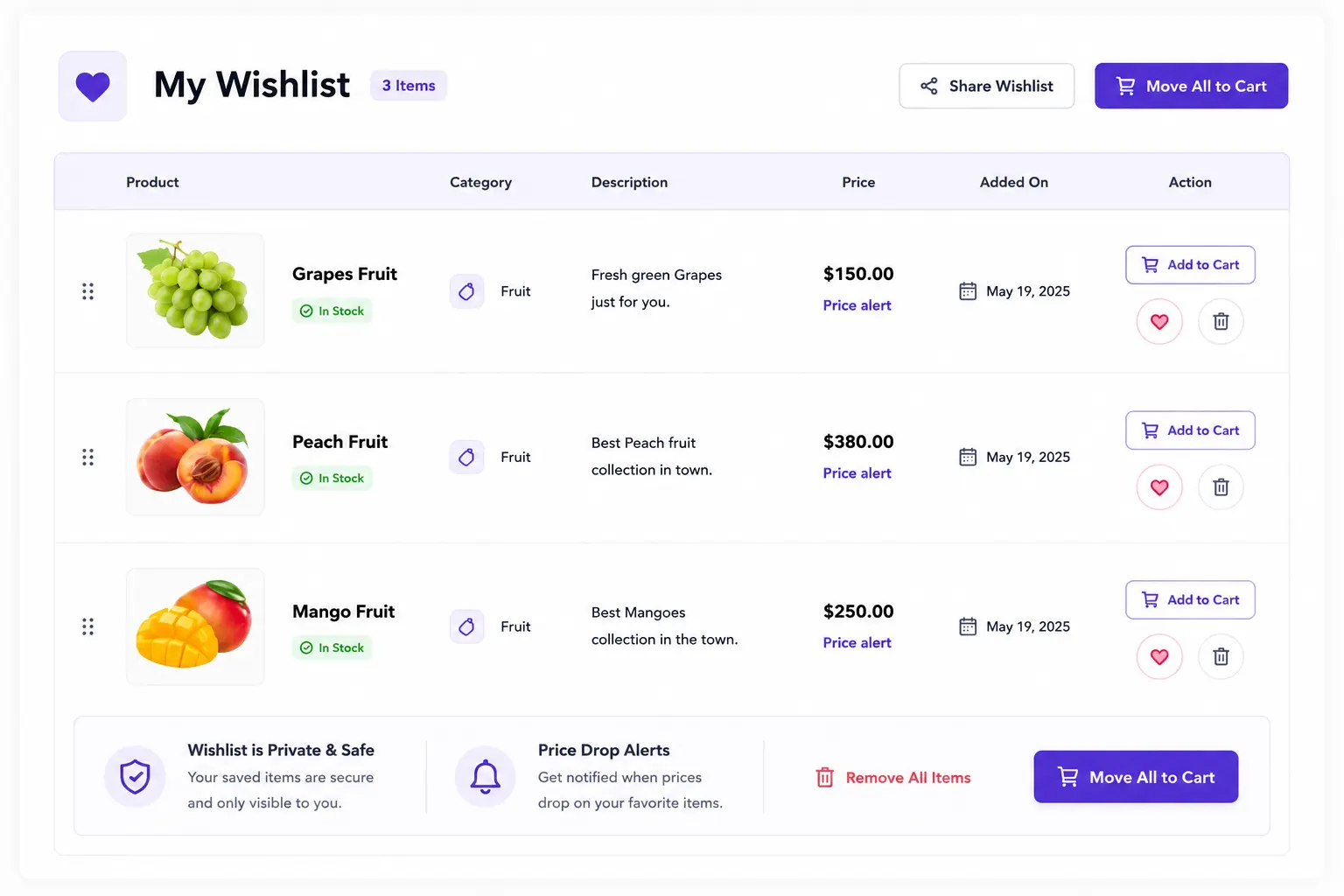
The wishlist needs to be easy to find. A header placement or a tab in the My Account page keeps it accessible. The page itself should look intentional: clean layout, branded styling, and a clear path from “saved item” to “buy now.”
A poorly styled wishlist page that looks like an admin screen doesn’t inspire confidence. A well-designed one that looks like part of the store keeps shoppers engaged with the products they saved. That’s the difference between a feature and a revenue channel.
Final Tips for WooCommerce Upsells and Cross-Sells
Upselling and cross-selling in WooCommerce work when two things are true at once: the right offer is shown at the right moment, and the display is designed well enough that customers actually notice it.
Most stores have the first part reasonably figured out. The second part is where revenue is left on the table, session after session.
Start with one placement zone. Get the layout right, position the section where customers are already looking, and measure what changes. Then expand from there. The biggest wins in recommendation revenue don’t usually come from adding more products to your linked lists. They come from making the ones you already have impossible to miss.
Frequently Asked Questions (FAQs)
What is the difference between upselling and cross-selling in WooCommerce?
Upselling is when you suggest a better or more expensive version of the same product a customer is viewing. Cross-selling is when you suggest related or complementary products.
In WooCommerce, upsells appear on the product page, while cross-sells appear in the cart. Upselling increases the value of a single product; cross-selling increases the total number of items in the order.
Can you customize how WooCommerce displays upsells and cross-sells?
Yes, but not fully with default WooCommerce alone. WooCommerce lets you assign upsells and cross-sells, but your theme controls how they look and where they appear. For full control over layout and placement, you need a builder or plugin.
For example, tools like CoDesigner let you design and position these sections in Elementor with full styling control.
How many products should you show in an upsell or cross-sell section?
Upsells work best with 2–3 products. Cross-sells perform well with 3–5 products. Checkout offers should usually be limited to 1. Fewer, more relevant options convert better than large product lists.
Does placement actually affect Upsell Conversion Rates?
Yes. Placement directly impacts performance. Upsells near the Add to Cart button convert better than those placed lower on the page. Cross-sells in the cart outperform hidden or less visible sections. Checkout offers work best because purchase intent is highest. In short, the closer the offer is to the moment of purchase, the higher the conversion rate.