How to Add a Multi-Step Checkout to Your WooCommerce Store

Share this content
Copy Link
Share



Design WooCommerce Stores That Convert
-
100+ Widgets
-
15+ Modules
-
150+ Templates
-
At Your Service
Follow us on:


Checkout is where a sale either closes or quietly disappears.
Nearly 70% of online shopping carts are abandoned before checkout, and much of that is because the checkout process feels too long or too complicated. WooCommerce multi-step checkout is constantly searched for because store owners assume breaking checkout into stages will fix this. Sometimes it will. Sometimes the real fix is simpler than adding steps at all.
This guide walks through what multi-step checkout actually means, when it helps, and how to build a cleaner WooCommerce checkout using Elementor, without writing code or guessing at what belongs on the page.
Why Multi-Step Checkout Matters for WooCommerce Stores
A WooCommerce checkout can become complicated quickly. Billing details, shipping information, account creation, payment methods, coupons, order notes, and other fields can turn one page into a long form.
17% of US online shoppers say they’ve abandoned an order specifically because the checkout process felt too long or complicated, according to the same Baymard data.
A multi-step checkout addresses this by separating the process into focused stages.
1. Makes a Long Checkout Easier to Scan
Customers do not have to process every checkout field at once. Instead, they see only the information needed for the current step.
For example:
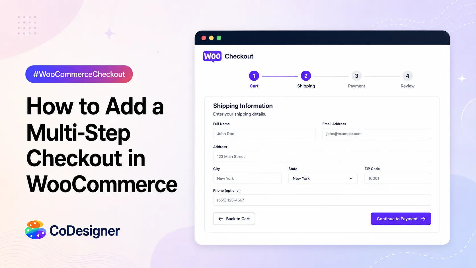
Step 1: Contact information
Step 2: Shipping details
Step 3: Payment
Step 4: Order review
This creates a clearer path from cart to purchase.
2. Reduces the Feeling of a Complicated Form
A long checkout form can look like a task rather than the final step of buying. Splitting related fields into smaller sections makes the process feel more manageable.
This is particularly useful for stores that need more information than a basic name, email, address, and payment form.
3. Helps Customers Find and Fix Errors
When everything appears on one page, customers may have to scroll through several sections to find a missing or incorrect field.
With a multi-step checkout, validation can happen within the relevant section. A customer can correct their contact or shipping information before moving forward instead of discovering the problem at the end.
4. Creates a Clear Sense of Progress
Checkout abandonment can happen when customers are unsure how much more information they need to provide.
A progress indicator such as Information → Shipping → Payment → Review gives customers a clear idea of where they are and what remains.
5. Gives Complex WooCommerce Stores More Room to Organize Checkout
Not every store has the same checkout requirements.
A simple digital product store may need only a few fields, while a physical-product store may need shipping details, delivery preferences, tax information, and additional order details.
Multi-step checkout gives store owners a practical way to organize these requirements without putting every field into one crowded form.
6. Keeps the Customer Focused on One Decision at a Time
A good checkout should move customers toward completing the order, not make them stop and figure out what to do next.
Breaking checkout into logical stages reduces the number of decisions presented simultaneously. Customers can complete one part, move forward, and then handle the next.
But there is an important distinction. Adding more steps does not automatically improve checkout. If the process is unnecessarily long, hides important information, or makes navigation difficult, a multi-step layout can create more friction rather than less.
The real objective is to organize the checkout journey around the customer’s needs, not simply divide one long form into several pages.
Multi-Step vs. Single-Page Checkout: Which Should You Use?
There is no universal winner between multi-step and single-page checkout. The better choice depends on how much information your store actually needs and how complicated the purchase is.
The key question is not “Which checkout format converts better?” It is:
“What is the simplest checkout structure that lets this customer complete the purchase without unnecessary friction?”
(i) When Multi-Step Checkout Makes Sense
A multi-step layout becomes useful when putting everything on one screen makes the checkout difficult to understand or navigate.
Consider it when your store has:
- Complex product configurations: Customers need to select multiple options before payment.
- Detailed shipping requirements: Shipping addresses, delivery preferences, and other logistics need their own section.
- Multiple checkout decisions: Customers may need to choose shipping, billing, payment, and other options.
- Large amounts of required information: A single long form can become difficult to scan and complete.
- A checkout that needs clear progress: Labels such as “Shipping → Payment → Review” tell customers exactly where they are and what comes next.
This is where a progress indicator can add real value. Stripe notes that showing progress, such as “Step 2 of 3,” can give shoppers a clearer sense of how much of the checkout remains. A multi-step structure can also make it easier to identify where customers are dropping out of the process.
(ii) When Single-Page Checkout Is the Better Choice
If the order only requires a handful of fields, splitting those fields across multiple screens can create unnecessary clicks.
A single-page checkout is often the more practical choice when:
- The store sells straightforward products.
- Customers need only basic billing and shipping information.
- There are few shipping or payment decisions.
- The checkout already fits comfortably on one page.
- Customers can review and submit the order without excessive scrolling.
For example, asking a customer for their name, email, address, shipping method, and payment information does not necessarily justify four separate steps.
In this situation, the problem is usually not the checkout structure. It is the number of fields.
(iii) The Important Distinction: Structure vs. Friction
This is where many WooCommerce stores make the wrong optimization.
- Multi-step checkout solves an organization problem.
- Field reduction solves a friction problem.
If a checkout contains 25 unnecessary fields, turning those fields into five steps does not make the checkout simpler. It simply distributes the same friction across five screens.
Before adding steps, first ask: Can I remove anything the customer does not need to provide?
If the answer is yes, reduce the fields first. If the remaining checkout is still complex, then a multi-step structure becomes much easier to justify.
What to Plan Before You Build a Multi-Step Checkout?

Choosing a multi-step checkout is only the first decision. The next step is deciding what each step should contain.
1. Map the Customer’s Actual Journey
Start with the order itself, not your page builder.
Write down everything the customer must do from the moment they reach checkout to the moment the order is placed:
Contact → Billing/Shipping → Delivery → Payment → Review
Then remove anything that does not contribute to fulfilling the order or completing payment.
This prevents a common mistake: creating steps simply because the checkout can be divided into steps.
2. Group Related Information Together
Each step should have a clear purpose.
For example:
- Step 1: Contact & Billing- Name, email, billing address
- Step 2: Shipping- Shipping address and delivery method
- Step 3: Payment- Payment method and billing confirmation
- Step 4: Review- Products, quantities, shipping cost, taxes, and final total
The exact structure will vary by store, but the principle remains the same: customers should know why they are on each screen.
3. Remove Fields That Do Not Need to Be There
Before adding a multi-step plugin or redesigning checkout, audit the default WooCommerce fields.
Ask of every field:
- Is it required to process the order?
- Is it required for shipping?
- Is it required by the payment method?
- Does the business genuinely use the information?
- Can the information be collected somewhere else?
Fields such as company name, address line 2, and order notes may not be necessary for every store. Removing fields that serve no clear purpose can reduce friction without adding another checkout step.
For a detailed breakdown of which WooCommerce checkout fields you can keep, remove, or customize, see this guide to customizing WooCommerce checkout fields.
4. Decide What Customers Need to See Before Moving Forward
A customer should not have to complete one step blindly and discover an important cost or requirement several screens later.
For example, if shipping charges are calculated after the shipping address is entered, the next stage should make the resulting cost clear before payment.
The same applies to:
- Shipping fees
- Taxes
- Discounts
- Delivery options
- Product quantities
- Final order total
The checkout should progressively reduce uncertainty, not introduce it.
5. Make Navigation Predictable
A multi-step checkout should never feel like a sequence of locked pages.
Customers should be able to understand:
Where am I? → What do I need to complete? → What happens next?
Use clear step labels, visible progress, descriptive buttons, and an easy way to return to previous information when corrections are needed.
The goal is not to make checkout look more sophisticated. It is to make the customer’s path to Place Order easier to understand.
How to Build a Cleaner, Step-Like WooCommerce Checkout with Elementor
1. Install CoDesigner and CoDesigner Pro
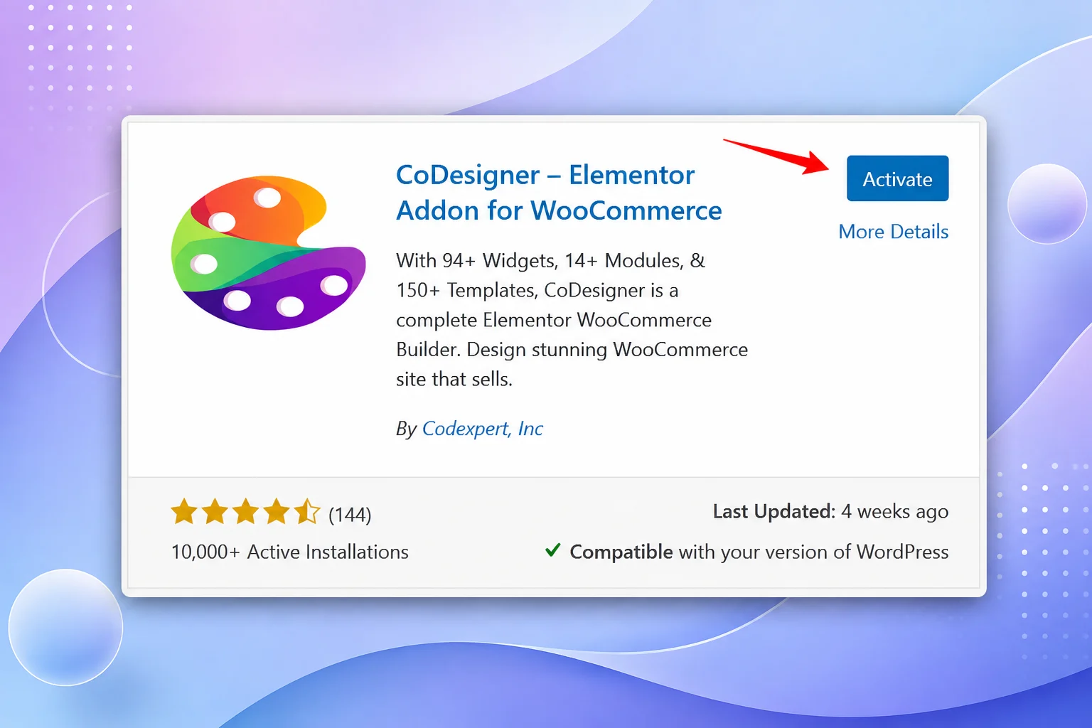
Install the free CoDesigner plugin from the WordPress repository, then activate CoDesigner Pro with a license key to unlock the Checkout Builder module. Both need Elementor (free or Pro) already running on the site, since CoDesigner builds directly on top of it rather than replacing it.
2. Enable the Checkout Builder Module
Head to CoDesigner’s module settings in the WordPress dashboard and switch on Checkout Builder.

This is what hands the WooCommerce checkout page over to Elementor’s drag-and-drop editor instead of leaving it locked to WooCommerce’s default template.
3. Open the Checkout Page in Elementor
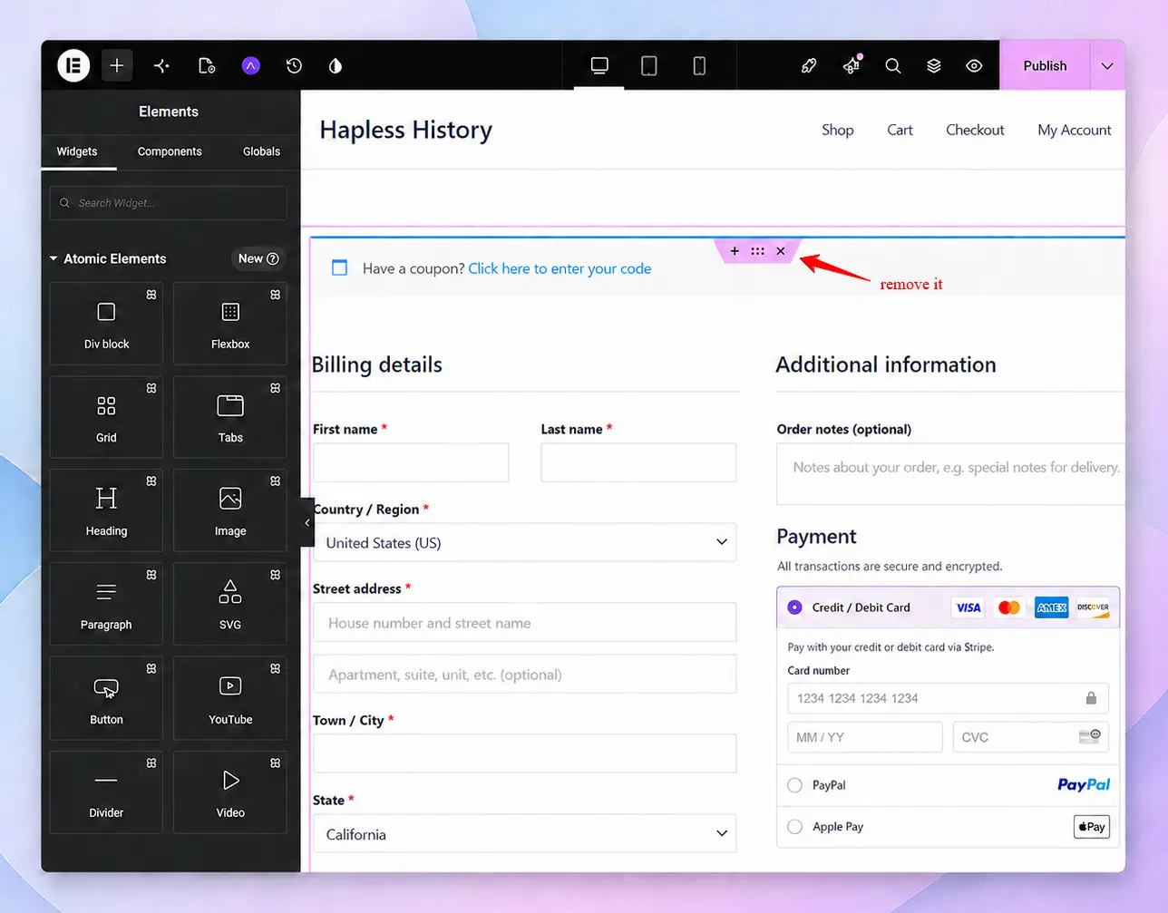
If you are editing the existing WooCommerce checkout page, then remove the existing section of the WooCommerce default checkout.
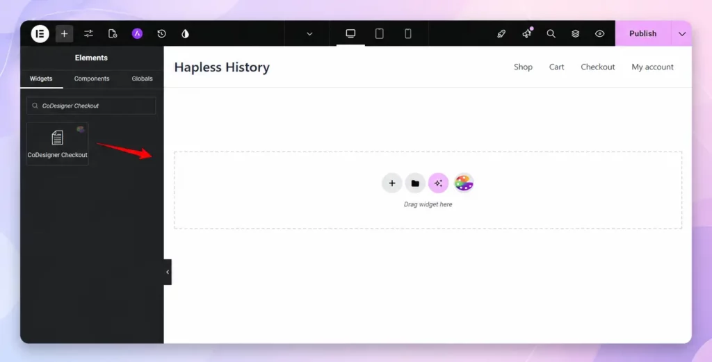
4. Add the Checkout Builder
CoDesigner offers pre-made templates for WooCommerce checkout. Now you have to add the CoDesigner Checkout Builder widgets to the page you have just created.
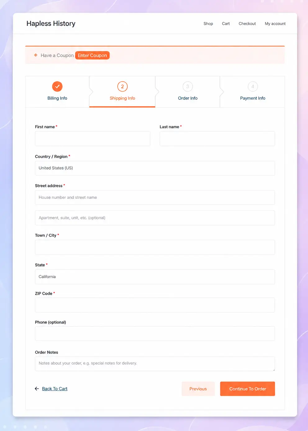
If you want to customize anything, CoDesigner offers the flexibility to customize your checkout page your way. This is how your multi-step checkout page will look.
5. Add Trust Elements in Checkout
Drop in trust signals like security badges and guarantee text next to the payment section, since adding checkout trust elements tends to do as much for completion rates as the layout itself.
6. Remove Unnecessary Friction Points
Go back through the finished layout and cut anything not required for fulfillment. Offer guest checkout instead of forcing an account.
Show shipping costs and taxes before the final step instead of surprising shoppers with them at the end, since unexpected costs are consistently the top reason people abandon an order.
These are the same fundamentals covered in this WooCommerce conversion rate optimization guide, which is worth a read if checkout is only one part of a broader conversion problem.
Final Thoughts
Multi-step checkout isn’t a magic fix for cart abandonment, and single-page checkout isn’t automatically the wrong choice either. What actually moves the needle is cutting unnecessary fields, showing costs upfront, and organizing whatever’s left into a layout a shopper can process in seconds.
Whether that ends up as one clean page or three short ones matters less than making sure every field earns its place.
Pull up your own checkout page this week and count the fields. If the number is higher than what fulfillment actually requires, that’s the place to start.
Frequently Asked Questions
01. Does WooCommerce support multi-Step checkout by default?
No. WooCommerce uses a single-page checkout by default. A multi-step checkout requires a plugin like CoDesigner or custom development.
02. How many fields should a WooCommerce checkout have?
As few as necessary. Remove optional fields that are not needed to process or fulfill the order.
03. Will simplifying checkout hurt my data collection?
Not necessarily. Keep checkout focused on the purchase and collect non-essential information after the order.