One-Page vs Multi-Step Checkout: Which Converts Better in 2026?

Share this content
Copy Link
Share



Design WooCommerce Stores That Convert
-
100+ Widgets
-
15+ Modules
-
150+ Templates
-
At Your Service
Follow us on:


Most WooCommerce stores lose more sales at checkout than anywhere else on the site. Shoppers browse, add to cart, then disappear at the exact moment they were ready to pay.
The one-page vs multi-step checkout question sits right on top of that leak. Too many store owners answer it by copying the layout they read about last week – and that guesswork costs real money.
A smarter approach ties your checkout format to how your customers actually buy. This guide covers three things:
- What the conversion data shows,
- The factors that should drive your choice, and
- How to build either layout in WooCommerce without code.
By the end, you will know which format fits your store, and how to prove it with your own numbers.
One-Page vs. Multi-Step Checkout: Quick Comparison
Here is the short version before we go deeper. Use it to spot which column your store leans toward, then read on to confirm it.
| Factor | One-Page Checkout | Multi-Step Checkout |
| Best for | Low-value, impulse, repeat buyers | High-value, complex, first-time buyers |
| Typical AOV fit | Lower carts | Higher carts |
| Device fit | Strong on mobile | Works, needs careful design |
| Customer type | Returning, confident | New, cautious |
| Key benefit | Speed – no page reloads to slow the buyer | Captures email early, cleaner step analytics |
| Upsell room | Tight | More space between steps |
| Analytics clarity | Field-level tracking needed | Clean step-by-step drop-off view |
| Main risk | Long page can feel heavy | Every extra page invites exit |
One-Page vs. Multi-Step Checkout, Defined
Before comparing performance, it helps to be precise about what each layout does, because the names get used loosely.
What Is a One-Page Checkout?
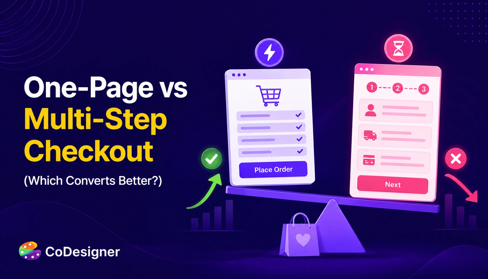
A one-page checkout puts everything on a single screen. Shipping, billing, payment, and the order summary sit together, and the customer scrolls through one uninterrupted flow with no page reloads between stages.
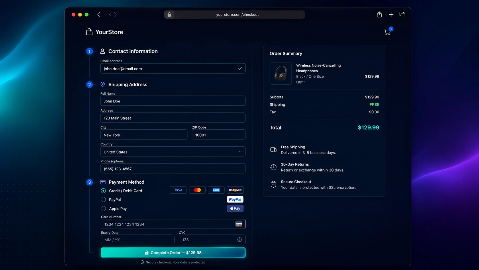
The appeal is speed and transparency. Shoppers see the full scope of what you are asking from them the moment they land, so there is no hidden effort waiting on the next screen.
What Is a Multi-Step Checkout?
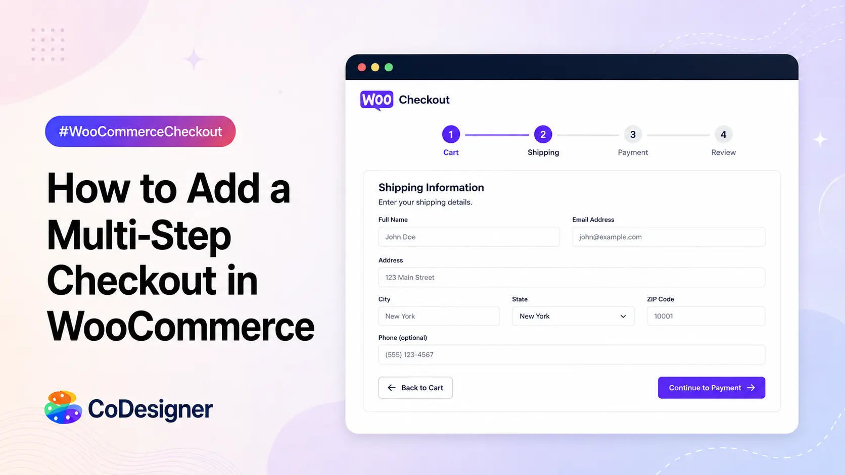
A multi-step checkout splits the same fields across sequential stages – usually contact details first, then shipping, then payment, then a final review. Each stage is its own screen, often with a progress bar showing how far along the buyer is.
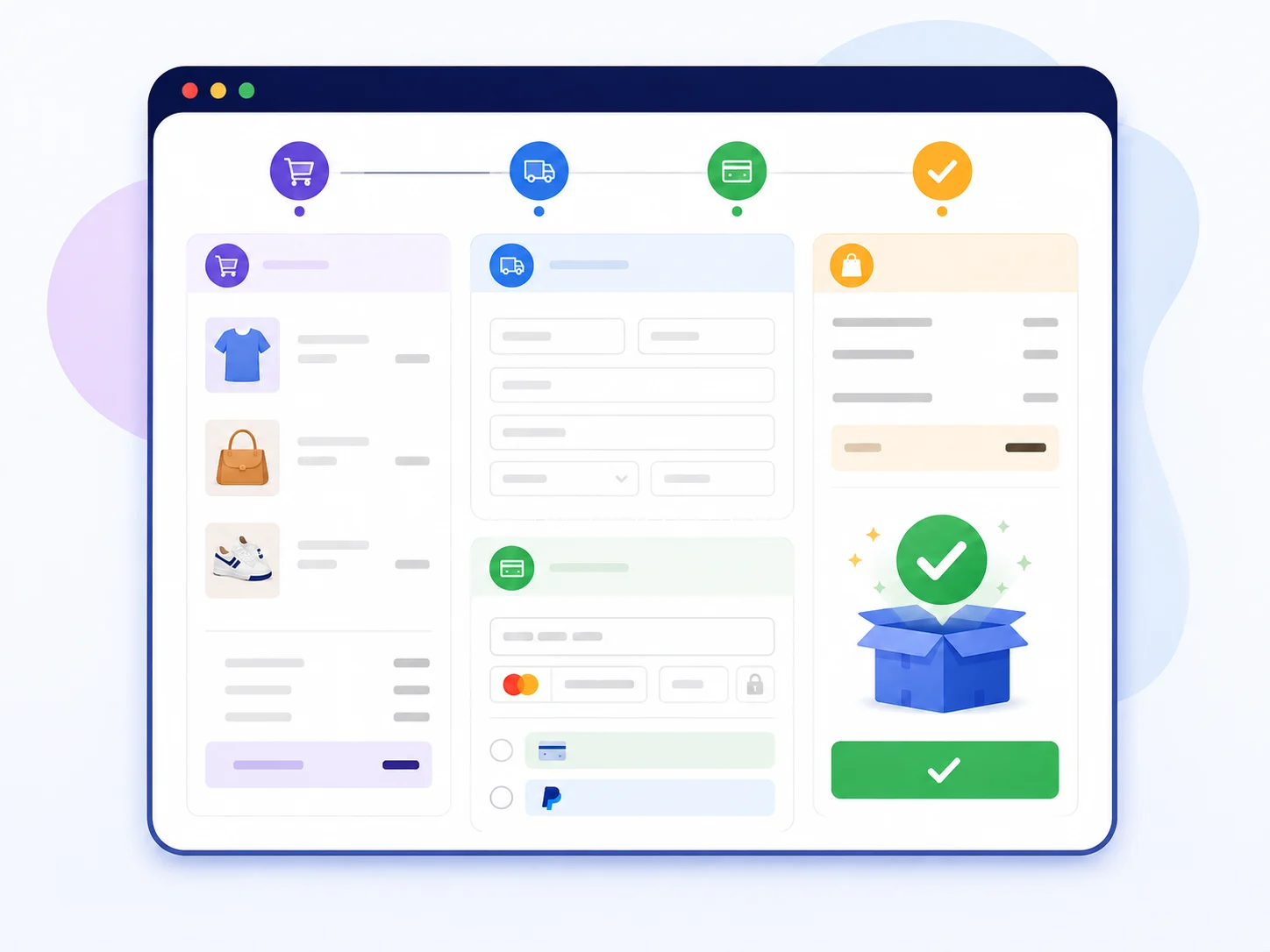
The idea is to break a long form into smaller, less intimidating chunks. One task at a time feels lighter than a wall of fields, especially for a nervous first-time buyer.
The real trade-off is simple to state and harder to resolve:
- One-page removes friction from moving between screens.
- Multi-step reduces the mental load of any single screen.
Which matters more depends entirely on your store.
Does One-Page or Multi-Step Checkout Convert Better?
Neither layout wins on its own – the data shows the winner depends on your store, but it also reveals clear patterns worth knowing before you choose.
Here is where opinions usually take over from evidence. Let’s stick to primary research instead.
What Is the Average Cart Abandonment Rate?
The average cart abandonment rate is 70.22%, according to Baymard Institute, which aggregated 50 separate studies. Roughly seven of every ten shoppers who add to cart leave without paying.
That figure has barely moved in more than a decade, which tells you better payment technology alone has not fixed the checkout experience.
Some of that loss is unavoidable, since plenty of people are only window shopping. A large share is not:
- Baymard found 18% of shoppers have abandoned an order specifically because the checkout was too long or too complicated. That single cause is design, not intent – and design is something you control.
- The same research estimates that fixing documented checkout usability issues can lift conversion by up to 35.26% for a large store.
Stripe’s own audit work backs this up from another angle. Their research found that 99% of leading ecommerce sites make five or more basic checkout errors.
If the biggest brands are getting it wrong, a mid-sized WooCommerce store almost certainly has room to gain. The point is not to chase a trendy layout, but to optimize your checkout page around how your buyers behave.
Do Fewer Checkout Steps Increase Conversions?
Fewer steps usually do help, and the benchmarks show why. Baymard’s data shows the average checkout runs 5.1 steps and 11.3 form fields, while an ideal flow can be as short as 12 to 14 total form elements.
Most stores are asking for more than they need. Every extra field and every extra page is another moment where a distracted buyer can drift off.
This is the core argument for one page. According to Stripe’s comparison, a one-page flow cuts the page loads and pauses that give shoppers time to second-guess the purchase. On a shaky mobile connection, each reload is a real risk – collapse the flow into a single scroll, and you remove those exit points entirely.
Stripe also reports that businesses using its conversion-optimized Payment Element see about 11.9% more revenue on average, a reminder that small checkout gains compound into meaningful money.
When Does Multi-Step Checkout Win?
Multi-step wins when you need the email early, room for upsells, or cleaner analytics – and the honest data does not pretend otherwise. It keeps three clear advantages that matter for the right store:
- It captures the email early. Because a multi-step flow usually asks for contact details in the first stage, you can trigger abandoned-cart recovery even when the shopper bails before paying. A one-page flow captures nothing until the full form is submitted.
- It leaves room for upsells. You can place contextual offers – a shipping upgrade or a warranty add-on – between stages without cluttering the main form.
- It produces cleaner analytics. When a buyer drops between the shipping and payment screens, you see exactly where. On a single page, you need field-level tracking to learn the same thing.
So the question was never which layout is objectively better. It is the layout that matches your store.
How to Choose Between One-Page and Multi-Step Checkout
This section is the one that actually moves your revenue. Run your store through these four filters.
(i) Match the Format to Your Average Order Value
Money changes behavior.
For low-value and impulse purchases, speed wins, and a one-page checkout suits the moment. Nobody wants to click through three screens to buy a $20 phone case.
For higher-value orders, buyers slow down on purpose. They want to feel deliberate before spending a lot, and a structured multi-step flow can match that mindset rather than fight it. There is a rough consistency across studies where lower carts favor speed and higher carts favor consideration.
Picture two stores side by side:
- A phone-accessories shop with a $25 average order and heavy mobile traffic wants the shortest path possible – so one-page fits.
- A furniture store with a $600 average order and detailed delivery options benefits from a guided flow that lets the buyer breathe between decisions.
Same debate, opposite answers, and the difference is the cart, not the trend.
(ii) Factor In Your Product Complexity
How much do you have to ask the customer?
A store selling simple physical goods needs a name, an address, and a payment method. That fits comfortably on one page.
A store handling custom configurations, made-to-order items, delivery scheduling, or B2B purchase details has more to collect. Cramming all of it onto one screen creates the exact wall of fields that scares people off – so more required information tends to favor a staged flow.
(iii) Weigh Your Device and Traffic Mix
Mobile shoppers behave differently. Typing is harder, attention is shorter, and every reload is a chance to lose them.
If most of your traffic is mobile, a well-built one-page flow with autofill and large tap targets often performs better, because it lives in a single scroll.
That said, a one-page checkout stuffed with heavy scripts can load slowly, and a slow single page will lose to a fast multi-step flow every time. Speed is part of the layout decision, not separate from it.
(iv) Consider New vs Returning Customers
Returning customers know your brand and want it out of the way fast. One-page serves them well.
First-time buyers are more cautious. Clear steps with a progress indicator reassure them that the process is secure and logical.
If your store leans heavily on new-customer acquisition, the slight slowdown of a guided flow can actually raise completion – because confidence matters more than raw speed for someone who has never bought from you.
No single answer covers every store. Map your AOV, product complexity, device split, and customer mix, and the right format usually becomes obvious.
Build Either Checkout in WooCommerce
WooCommerce ships with a serviceable default checkout, but it was never designed to flex around your specific store. Reshaping it is where the real gains show up.
How to Set Up a One-Page Checkout
If your store fits the one-page profile, condensing the flow is the first move. You can set up one-page checkout so the cart and payment sit together and buyers finish without hopping between screens.
The goal is a single, clean scroll with clear section headers – not one long, undivided form.
Trimming Fields and Friction
Whichever format you pick, fewer fields help. Audit your checkout and remove anything you do not truly need to fulfill the order. WooCommerce lets you add extra checkout fields when a field earns its place, and just as importantly, cut the ones that do not.
For deeper control over layout and styling, you can customize the WooCommerce checkout page with a visual builder rather than raw code. The less someone has to fight template files and PHP, the faster they can test a real change.
How CoDesigner Builds Both Checkout Types
Can one plugin handle both formats? Yes, and that flexibility is the point. CoDesigner adds a Checkout Builder module that lets you design the WooCommerce checkout inside Elementor by drag and drop, so neither layout means touching code.
- For a multi-step flow, its Checkout Builder includes a multi-tier checkout type that splits fields across ordered stages with a clear progression.
- For a one-page flow, you can pair a single-screen checkout template with the Skip Cart Page module, which sends shoppers from the product straight to one checkout screen instead of routing them through a separate cart.
Either way, you can add, remove, and rearrange form fields, start from ready-made checkout templates, and style the whole flow to match your brand.
One practical detail helps when you are still deciding. You can build and edit a new checkout page while your current one stays live, so you can trial a format on a draft before making it the default. That turns a format switch into a low-risk experiment rather than a gamble.
Add Trust Signals at the Payment Step
Layout is only half the battle. The moment you ask for card details, doubt spikes.
Adding visible checkout trust signals near the payment fields tends to lift completion, especially for lesser-known brands:
- Security badges,
- Recognizable payment logos, and
- A clear return policy.
A fast layout with no reassurance still leaks sales.
Which Checkout Should You Choose?
Choose the layout that matches how your customers buy, not the one a trend guide names. There is no universal winner between these two layouts, and any guide that names one is selling you a shortcut that does not exist.
Weigh your average order value, product complexity, device mix, and the balance of new versus returning shoppers, then pick the layout that fits and prove it with your own data.
Start small:
- Pull your current checkout completion rate.
- Remove the fields you do not need.
- Test one format change against your baseline.
The stores that win at checkout are not the ones chasing trends. They are the ones willing to measure, adjust, and let the numbers decide.
Frequently Asked Questions
Is one-page checkout always better for conversions?
No. One-page checkout tends to convert better for low-value, impulse, and repeat purchases, and it usually performs well on mobile.
Multi-step checkout can convert better for high-value orders, complex products, and first-time buyers who need reassurance. The right choice depends on your store, not on a universal rule – so test it before committing.
Does a one-page checkout hurt SEO or site speed?
Not by design, but a poorly built one can. Placing every field on one screen means more elements load at once, so a page bloated with heavy scripts may slow down.
Since load speed affects both conversions and search performance, keep the page lean, use efficient code, and test it on real mobile connections. A fast one-page checkout carries no inherent SEO penalty.
Can you A/B test checkout layouts in WooCommerce?
Yes. The most reliable method is splitting traffic so half your shoppers see one format and half see the other, then comparing completion rate, average order value, and where drop-offs happen. Stripe recommends this exact split-testing approach.
If a true A/B test is out of reach, a before-and-after comparison still reveals useful trends, as long as you account for seasonality.
Which checkout is better for mobile shoppers?
One-page checkout often has the edge on mobile, because it removes the page reloads that break momentum on slower connections.
That advantage only holds if the page is fast and touch-friendly, with autofill and large buttons. A slow, cramped single page will underperform a clean multi-step flow, so build for mobile first, regardless of the format you choose.