WooCommerce Checkout: How to Increase Conversions with Trust Elements

Share this content
Copy Link
Share



Design WooCommerce Stores That Convert
-
100+ Widgets
-
15+ Modules
-
150+ Templates
-
At Your Service
Follow us on:


Picture a shopper who just clicked “Proceed to Checkout” on your WooCommerce store. The next 30 seconds will decide everything.
They’ll either feel confident enough to enter their card details, or they’ll spot one small thing that makes them hesitate and close the tab.
That difference almost always comes down to trust elements. The small visual signals that tell a buyer your store is real, your products are good, and their money is safe.
This guide breaks down the exact trust elements that move buyers from “I’ll think about it” to “I’ll buy it now.” You’ll learn what to add, where to add it, and why each piece works.
Why Do Customers Abandon WooCommerce Checkout?
The average cart abandonment rate sits around 70%, according to Baymard Institute research. That means 7 out of every 10 people who add a product to their cart never finish the purchase.
Price is rarely the real reason. Here’s what actually pushes them away:
- They’ve never heard of your brand
- They don’t see reviews from real buyers
- They’re unsure if their payment info is safe
- The total cost suddenly looks higher than expected
- They can’t tell if the size or fit is right
- The checkout looks plain or inconsistent with the rest of the store
Notice the pattern? Almost every reason comes down to one thing – doubt. If your checkout doesn’t remove that doubt fast, the buyer leaves. Often forever. Trust elements are just one piece of a bigger picture; our guide on WooCommerce conversion rate optimization strategies covers the wider playbook.
What Are Trust Elements in WooCommerce?
Trust elements are visual signals in your store that reassure buyers your shop is real, your products are good, and their money is safe.
They include things like:
- Star ratings on product pages
- Customer reviews
- Recognized brand logos
- Sale and “best seller” badges
- Payment icons (Visa, PayPal, Apple Pay)
- Size charts
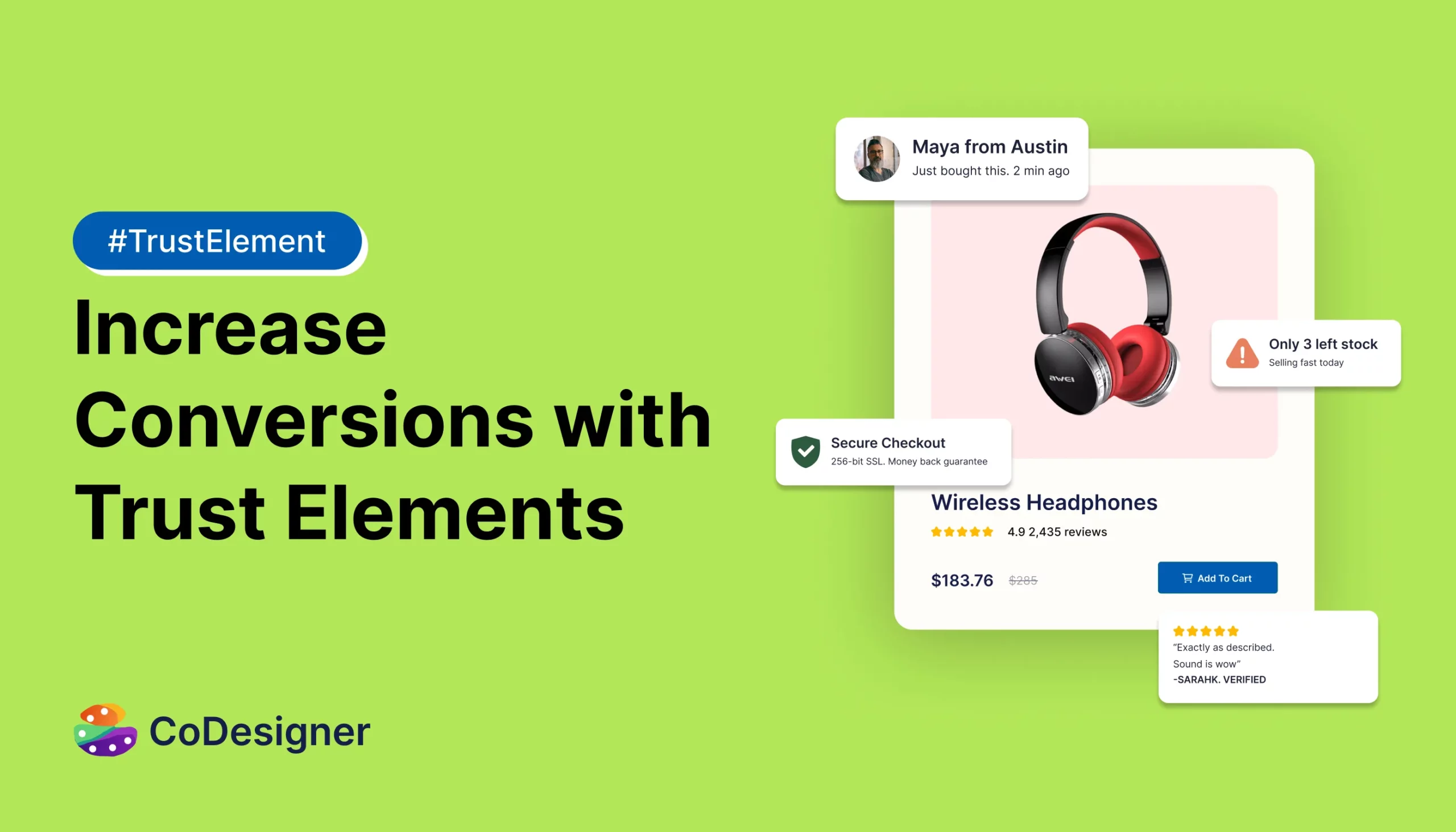
- Live notifications showing recent purchases
- A clear order summary at checkout
- A consistent, well-designed checkout layout
- Thank you message and email after checkout
Each one chips away at hesitation. Together, they make your store feel real and safe to buy from.
How Do Trust Elements Increase WooCommerce Checkout Conversions?
Trust elements work because they answer the silent questions every shopper has:
- “Is this product actually good?” → Reviews and ratings
- “Do other people buy here?” → Sales notifications and best sellers
- “Will it fit me?” → Size charts
- “Can I trust this brand?” → Brand logos and badges
- “Is my card safe here?” → Payment method icons
- “Does this look like a real store?” → Consistent design and clear order review
When these questions get answered without the buyer having to ask, the path to checkout becomes smooth.
The exact lift varies by store, but research from Baymard Institute shows that fixing checkout usability and trust gaps is one of the highest-ROI improvements a store can make.
Let’s look at the trust elements that matter most.
Social Proof Elements That Boost WooCommerce Conversions
Social proof is the most powerful conversion driver in ecommerce. People trust other people more than they trust brands.
Here are the three elements that deliver the strongest social proof results.
1. Product Ratings
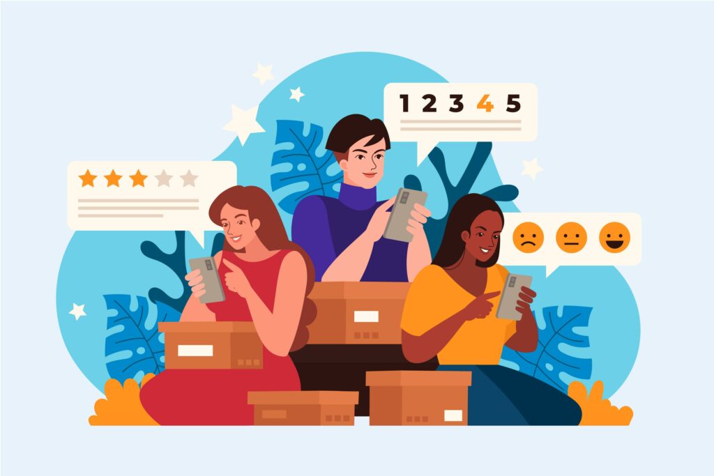
A simple 5-star rating display under each product title helps shoppers decide faster. Most buyers scan before they read. The stars catch the eye in less than a second.
A product page with a clean rating display shows:
- Average score (like 4.7 out of 5)
- Total number of reviews
- Visual stars that match your site’s design
Place ratings right below the product title and again near the “Add to Cart” button. This way, the rating stays visible no matter where the buyer is on the page.
2. Customer Reviews
A Spiegel Research Center study at Northwestern University found that displaying reviews can increase conversion rates by up to 270%, especially for higher-priced products.
But how you display reviews matters as much as having them. A wall of plain text is easy to ignore. A well-designed review section gets read.
There are a few popular layouts worth trying:
- Classic grid layout – clean rows of reviews with photos, good for stores with many short reviews
- Standard list layout – simple, easy to scan, works well on mobile
- Trendy carousel layout – modern sliding reviews with star ratings, perfect for premium brands
The right format depends on your audience. A fashion store might lean trendy. A B2B store might prefer classic.
The key is showing real names, photos, and dates. Fake-looking reviews hurt more than no reviews at all.
3. Sales Notifications
Yes, you’re reading it right – sales notification is a trust element.
A small pop-up that says “Sarah from Toronto just bought the Linen Tote” is pure social proof. It tells the shopper:
- The store is real and active right now
- Other people are buying, so it’s safe to buy too
This is the bandwagon effect at work. Shoppers feel more confident when they see others making the same decision.
A few rules to follow:
- Show real, recent purchases – not fake names
- Don’t fire them more than every 30–45 seconds
- Keep the design subtle, not flashy
- Always include the buyer’s first name and city if possible
- Avoid running them on the checkout page itself – they distract from the final step
Overdoing it makes the store feel spammy. Used right, it shows the store has steady activity. For setup, see our walkthrough on adding live sales notifications to WooCommerce.
Product-Level Trust Signals That Reduce Buyer Hesitation
Trust doesn’t just live on the checkout page. It starts the moment a shopper lands on a product. These three signals work quietly but make a big difference.
How Product Brand Logos Influence Buying Decisions
If you sell products from known brands, show their logos.
A buyer browsing electronics will trust a store that clearly displays Sony, Bose, and JBL logos far more than one that just lists product names.
Brand logos work because:
- They borrow credibility from names buyers already know
- They help shoppers filter by brand quickly
- They reduce the “is this real or counterfeit?” worry
Add a brand section on product pages and a brand filter on category pages. Even a dedicated “Shop by Brand” page can drive extra conversions.
What Are Product Badges and Why They Matter
Badges are small labels on product thumbnails that highlight key information.
Common badges include:
- “Best Seller”
- “New Arrival”
- “Free Shipping”
- “Sale” or “% Off”
- “In Stock”
- “Editor’s Pick”
A related but separate signal is scarcity – labels like “Only 3 Left” or “Selling Fast.” These work differently from badges. Badges build trust through endorsement. Scarcity creates urgency. Use both, but don’t mix them up.
Badges work because they guide attention. A shopper scanning 40 products doesn’t have time to read every detail. A badge tells them what to notice first.
The trick is to use them with restraint. If every product has 4 badges, none of them stand out. Keep it to one or two key badges per product.
Why Product Size Charts Reduce Returns and Cart Drop-offs
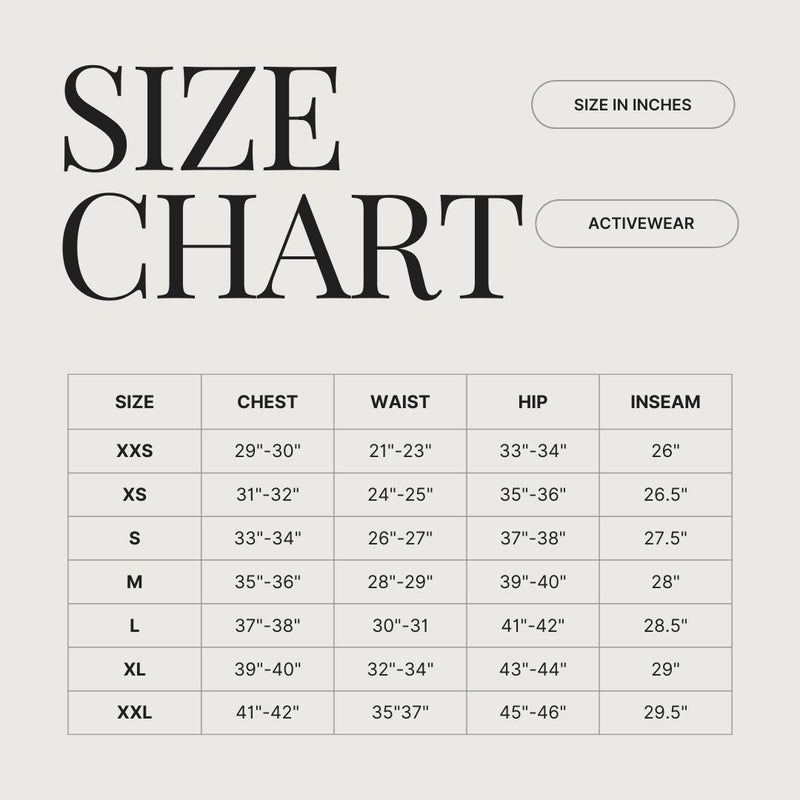
For clothing, footwear, and accessories, size doubt is a top reason for cart abandonment.
A clear, visual size chart solves this. It tells the buyer:
- The exact measurements in inches and centimeters
- How the brand fits compared to standard sizes
- Where to measure on their own body
Stores that add proper size charts often see fewer fit-related returns and stronger checkout completion. The buyer leaves the page with one less unanswered question.
Place the size chart link directly next to the size selector. Don’t bury it in a footer or FAQ section.
Why Wishlists Quietly Build Trust Too
Not every shopper is ready to buy on the first visit. A wishlist gives them a way to save items without losing momentum, and it tells them the store understands how real buying decisions work.
Stores with wishlists see higher return visits and stronger long-term conversions. Our guide on creating a beautiful wishlist for your WooCommerce store walks through the setup.
Trust Elements to Add to Your WooCommerce Checkout Page
The checkout page is where most of the doubt lives. Every second the buyer spends here, their brain looks for a reason to leave. Smart trust elements stop that from happening.
Most WooCommerce stores leave the default checkout untouched, which is one of the biggest missed conversion opportunities. Our guide on customizing the WooCommerce checkout page covers the practical setup, and our checkout page optimization guide explains what to prioritize.
Should You Display Payment Method Icons at Checkout?
Yes. Always.
Showing the logos of Visa, Mastercard, PayPal, Apple Pay, and Google Pay tells the buyer two things:
- This store accepts the payment method they prefer
- This store works with payment systems they already trust
A small row of payment icons near the “Place Order” button removes one of the last doubts a buyer has. Baymard’s checkout research consistently lists payment trust as a top abandonment factor. If you’re still picking the right gateways, our breakdown of the top WooCommerce payment gateway plugins is a good starting point.
Don’t hide them in the footer. Put them where the buyer’s eyes are – right at the moment of the payment decision.
Why a Clear Order Review Section Builds Last-Minute Trust
The biggest checkout killer is surprise.
A buyer who thinks they’re paying $40 and sees $58 at the last step will close the tab. No exceptions.
A clean order review section prevents this. It should clearly show:
- Each item with image, name, and price
- Quantity
- Shipping cost
- Taxes
- Discounts (if any)
- Final total
Bonus tip: let buyers edit quantities or remove items directly from this section. The fewer back-and-forth clicks, the better. If you collect extra info during checkout (like delivery dates or gift notes), see our guide on adding additional fields to WooCommerce checkout.
A transparent order review is one of the most underrated trust builders in ecommerce.
Don’t Forget Mobile Trust
Over 60% of WooCommerce traffic comes from mobile. But most stores design their checkout for desktop first.
On mobile, trust elements need extra care:
- Payment icons should stay visible without scrolling
- Reviews should be readable without zooming
- Size charts should open in a clean overlay, not a new tab
- Buttons should be thumb-sized, not desktop-sized
A mobile checkout that feels cramped or slow loses trust faster than a desktop one. Test your own checkout on a real phone, not just a browser preview. Many stores get strong mobile lifts by setting up a one-page WooCommerce checkout, which cuts the number of steps a thumb has to tap through.
How Best-Selling Products Sections Build Buyer Confidence
When a shopper is unsure what to buy, “Best Sellers” gives them an easy answer. A best-selling products section works on three levels:
- It removes decision fatigue
- It proves that other buyers found these products worth purchasing
- It increases the average order value when placed near the cart
Place a “Best Sellers” section on:
- The homepage (build immediate trust)
- Product pages (offer alternatives)
- Cart page (suggest add-ons)
Keep it limited to 4–8 products. Too many options reduce the trust-building effect. A related approach is using a smart related products section to keep shoppers engaged, our guide on engaging customers with related products covers the layout options, and our walkthrough on how to add related products in WooCommerce handles the practical setup.
Why Design Consistency Across Pages Builds Trust
Design Consistency is one of the trust factors that most store owners ignore.
A homepage that looks polished, followed by a checkout that looks like default WooCommerce, sends a confusing signal. It tells the buyer “you’ve left the brand and entered a generic form.” That break in design is one of the fastest trust killers in ecommerce.
Consistent design across product pages, cart, and checkout signals:
- This is a real, established brand
- The same team that built the homepage also built the checkout
- Nothing here is broken or borrowed
Match your fonts, colors, button styles, and spacing across every page. The pages that need the most attention are usually the shop page, the single product page, and the cart page, these are often left in default state while the homepage gets all the polish. Our roundup of WooCommerce design trends covers what modern stores are doing well.
Avoid Common WooCommerce Checkout Trust Mistakes
Stanford’s web credibility research found that design quality is one of the top factors in trust judgments. Not only these, but there are also more:
- Hiding shipping costs until the final step. Show estimated shipping early.
- Forcing account creation. Always allow guest checkout.
- No reviews on product pages. Even 3–5 reviews are better than none.
- Missing payment icons. Buyers want to see what’s accepted before they commit.
- No size charts. A must for fashion, footwear, and accessories.
- Cluttered checkout design. Too many fields and distractions kill trust.
- No clear return policy. Add a one-line link near the order summary.
Even good stores make these mistakes. They quietly drain conversions. Fixing even two or three of these makes a real difference in completion rates.
WooCommerce Checkout Trust Checklist
Use this quick checklist before your next site review:
- Product ratings are shown clearly on every product page
- Customer reviews are displayed in an easy-to-read layout
- Sales notifications running on key pages
- Payment method icons are visible at checkout
- The order review section is detailed and editable
- Best sellers and related products on homepage and product pages
- Brand logos are shown where relevant
- Product badges used with restraint
- Size charts available for sized products
- Wishlist available for buyers who aren’t ready yet
- Guest checkout option enabled
- Return policy visible at checkout
- Design stays consistent from homepage to checkout
- Mobile checkout is clean and thumb-friendly
If you can check off 10 out of 14, your store is in great shape.
Final Thoughts on Building a High-Converting WooCommerce Checkout
Trust isn’t built with one big element. It’s built with many small ones working together.
The good news? You don’t have to install ten different plugins to add all of these. Most stores get the best results from a single WooCommerce design toolkit that bundles ratings, reviews, sales notifications, badges, brand displays, size charts, payment icons, order review layouts, wishlists, and best seller sections in one place.
Trust also doesn’t end at checkout. Post-purchase emails, order confirmation, shipping updates, and thank-you messages are part of the same trust chain. Our guide on designing WooCommerce emails with Elementor and CoDesigner covers how to keep that experience consistent.
Pick the trust elements that match your store type. Add them with care. Test the results. Then refine. Your checkout doesn’t need to look fancy. It needs to feel safe.
Frequently Asked Questions
What is the average WooCommerce checkout conversion rate?
The average sits between 2% and 4% for most stores. Top-performing stores reach 5–8%, mostly by using trust elements and reducing checkout friction.
Do trust badges actually increase sales?
Yes. Trust badges, payment icons, and security labels consistently rank in Baymard’s research as factors that influence completion, especially for newer or smaller brands.
How many customer reviews do I need before they help conversions?
Even 5–10 reviews per product make a noticeable difference. Recency and authenticity matter more than total count; a few recent, real reviews beat a hundred old ones.
Where should I place trust elements on a WooCommerce store?
Place them at every key decision point – homepage, product pages, cart, and checkout. The closer they are to the “Buy” button, the stronger the impact.
Can sales notifications hurt conversions?
Only when overused. Showing too many pop-ups or fake-looking notifications damages trust. Keep them subtle, real, and spaced out.
Does the checkout design really need to match the rest of the site?
Yes. A checkout that looks like a different site breaks the brand experience and triggers doubt. Consistent fonts, colors, and layout across all pages keep the buyer feeling safe through the final click.